Payment UX is defined by what the POS system is built to handle behind the scenes, (not necessarily how it looks). As payment environments grow more complex, orchestration becomes the difference between experiences that feel calm and consistent, and those that start to break under pressure.
Key Insights
- Payment UX is shaped by system architecture, not interface design
- POS and EPOS systems determine how well checkout handles real-world variability
- Staff experience is the strongest predictor of customer experience at the till
- Orchestration keeps change away from the checkout, where it belongs
- The most resilient payment UX stays the same even as everything behind it evolves
Don't have time to read more now? Sign up to our newsletter to get the latest insights directly in your inbox.
When payment UX breaks down, it’s easy to blame the interface…
...But in modern retail, poor payment UX is rarely a design failure, as it’s almost always a system decision catching up with you.
Here, we’ll look at why checkout experience is now a POS strategy problem (not a user interface or user experience one) and how the features and architecture of POS and EPOS systems quietly determine whether payments feel effortless or frustrating.
You’ll discover what actually shapes payment UX in the real world, which EPOS system features matter most at the interaction point, (the precise moment where systems, staff and customers meet) and why designing for staff, exceptions, and change is the key to getting checkout right at scale.
Because, in payments, the best payment UX isn’t so much about the screen, it’s about what’s behind the scenes...
POS, EPOS, and the systems behind the screen
To understand why UX has become a strategic concern, it helps to start with what sits behind the interface.
When people ask what is a POS application, they’re usually thinking about the software that rings up sales. In practice, a POS application is the orchestration layer that connects devices, payment methods, business rules, and data into a single operational flow.
A POS device, on the other hand, is the hardware endpoint, i.e. terminals, tablets, kiosks, scanners, where that logic becomes visible.
An EPOS machine takes this further still. It combines hardware and software into a unified system designed for higher transaction volumes, multi-lane environments, and tighter integration with inventory, staff, and reporting. Rather than acting like a digital cash register, an EPOS system becomes the operational backbone of the store.
This distinction matters, because UX quality is ultimately constrained by what the system underneath can support.
Where payment UX is really shaped
In the same way a system can look perfect in a demo but behave differently in day-to-day use, payment experiences often feel super smooth in controlled conditions.
The difference shows up on a real shop floor. Connectivity fluctuates, payment providers respond at different speeds, customers choose different ways to pay, and staff need to handle refunds or split transactions without slowing the line.
When POS and EPOS systems are designed with this variety in mind, the payment experience stays consistent. When they aren’t, even a well-designed interface can start to feel a bit brittle.
This is why payment UX depends so heavily on system capabilities such as:
- Reliable connectivity
- Offline support
- Resilient routing to acquirers and processors, and...
- Consistent behavior across devices and locations
These decisions sit beneath the interface, but they directly influence how confident and fluid the interaction feels at the till.
When those foundations are in place, staff don’t need to think about the system, and customers don’t notice it at all. That’s usually the difference between a checkout that feels dependable and one that quietly introduces friction.
And that brings us to the features that quietly make (or break) that experience.
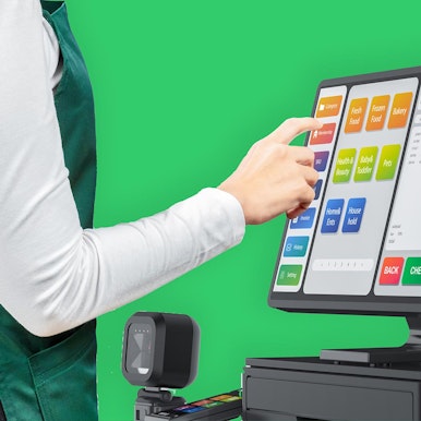
EPOS system features that shape the experience
EPOS system features are often discussed as functional capabilities, but their real impact is experiential...
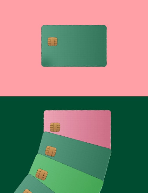
- Support for multiple payment methods reduces awkward pauses at the till.
- Offline modes and failover prevent dead screens when networks wobble.
- Unified data layers ensure totals, receipts, and inventory updates remain consistent.
- Device-agnostic flows allow staff to move between fixed tills, tablets, and mobile EPOS without relearning processes.
Individually, these may sound like technical details. Together, they determine whether checkout feels calm and predictable or tense and error-prone.
Because when systems handle complexity quietly, the experience feels simple, which is exactly what good UX is supposed to do.
That simplicity becomes most visible at a single moment: the interaction itself...
This is the interaction point (where strategy becomes UX)
Payment interactions behave much like any other real-time system, as in, they perform well when underlying components respond predictably, and they degrade quickly when those dependencies aren’t designed for variation.
The interaction point is the moment where speed matters, pressure is highest, and there’s little tolerance for delay or ambiguity. If something doesn’t behave as expected, the impact is very quick.
A good payment interaction feels straightforward. Staff know what to do next, even when the flow isn’t completely standard (whether that’s handling a refund, completing an age check, or splitting a payment). Clear prompts, predictable steps, and timely confirmation help maintain momentum at the till.
So why do some checkouts remain stable under pressure, while others start to feel fragile as soon as the flow deviates from the happy path?
The important point is that these qualities don’t come from interface design alone. They emerge when the system beneath the screen is built to support real-world behavior, for the people operating the system as much as for the people paying…
Designing for employees is designing for customers
-
Payment UX is often framed as a customer experience challenge, when in reality, it’s actually the staff experience that defines customer experience at the point of sale.
High turnover, seasonal hiring, and peak-hour pressure mean POS systems need to minimize cognitive load. Role-based views, guided actions, and consistent flows across devices reduce training time and prevent mistakes. When staff feel confident using the system, that confidence carries through to the customer.

Mobile EPOS and SoftPOS extend this further, supporting line-busting, assisted selling, and pop-up retail. But that only works when payment logic behaves the same way everywhere, so a refund processed on a tablet follows the same rules as one at a fixed till, and staff don’t have to second-guess what will happen next.
Which is why, at scale, payment UX stops being about individual screens and starts being about how the whole system is put together...
"When systems don’t work well together, the impact on customer experience often goes unnoticed at first. But it’s there. Small frustrations creep in - a POS system that’s slow to respond, a payment device that hesitates, data that has to be entered manually. Employees feel that friction, and it shows in how they serve customers.
Over time, those small irritations add up. Lines feel longer, interactions feel less positive, and customers start to go elsewhere.
When everything works smoothly, the opposite happens. Checkout feels easy. Employees stay relaxed and attentive. Customers leave with a positive impression - sometimes without even realizing why."
Richard van Uffelen, Senior Designer, Aevi
Why this is a POS strategy problem
Let’s look at the facts.
As we’ve already seen above, modern payment UX is shaped less by screens and more by what the POS system is built to handle behind the scenes...
- Multiple payment methods
- Mixed device estates
- More than one acquirer
- Constant change
When payments are treated as an add on to POS, that complexity spills into the experience. Adding a new payment method affects checkout flows. Switching acquirers forces retesting and retraining. Over time, these constraints show up at the interaction point as inconsistency and fragility.
So, if payment UX is a POS strategy problem, what’s the answer?
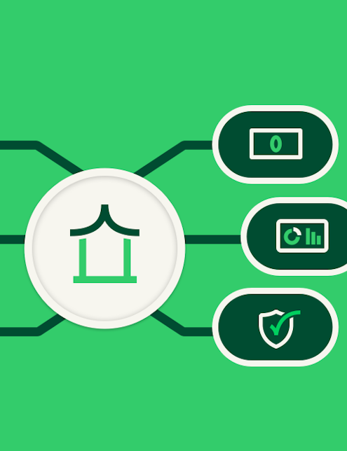
It’s orchestration.
Orchestration centralizes complexity at platform level, rather than pushing it into the checkout experience. By decoupling payment acceptance from processing, POS systems can evolve without redesigning front-end flows every time something changes.
Put simply, the checkout stays the same, even when what sits behind it changes.
With orchestration in place, changes happen behind the scenes. Payment methods, acquirers, and devices can evolve without disrupting how checkout works, (which is why the experience stays consistent as businesses scale).
In short, orchestration protects the experience over time, and that’s why it’s a strategic decision over a design one.
So, what does this mean for payment enablers?
The best payment UX is rarely noticed…and that’s exactly why it works.
For payment enablers, then, the real question isn’t how polished the checkout looks today, but how much change it can absorb tomorrow.
Can it handle new rails and new acquirers? New devices and new regions? All without disrupting merchants or retraining staff?
To answer questions, one practical place to start is this: look at where change currently shows up. If adding a payment method, switching an acquirer, or introducing a new device still means touching the checkout flow, that’s a sign the complexity is in the wrong place.
Because, great payment UX doesn’t come from designing the perfect screen - it actually comes from building systems that let the screen stay the same, while the brilliant changes happen behind the scenes.
Thinking about how to build payment UX that stays consistent as devices, acquirers, and payment methods change? Let’s talk about how to deliver consistent checkout experiences.
Interested in reading more around this subject? Here are some useful articles…